Pirates of the Caribbean. The trilogy are some of my favorite films. No, they're not perfect, but they're as fun as it gets. The films are rich with character and charm and that's largely due to director
Gore Verbinski, one of my favorites. He has a knack for finding the small character moments and letting them play out, giving his films a quirky personality that I love.
I'm taking a look at the 2 opening sequences of
Pirates of the Caribbean: Dead Man's Chest with this post. If you want to be a writer, a comic book artist and/or storyboard artist, or both,
this is the kind of thought and care you should put into your work. I believe strongly that comic books can have the same kind of care and detail, although you'll rarely see it in American comics. Want proof it can be done? Read
AKIRA. It's very cinematic in it's visual approach and is, hands down, my favorite comic book ever. I personally take a very cinematic approach to my comic book storytelling. Old school comic book artists will tell you that's not the ideal approach. They'll preach about more variety in your camera angles, leading the eye through a page more overtly, and the ability to break the 180˚ rule that you can't break in films. What's the 180˚ rule? Try
this.
My personal belief is that you can do
all of those things while still taking a primarily cinematic approach to your storytelling. There is one important side effect of this however: length. Stack the volumes of AKIRA on top of one another. It's big.
Really big. And while the story
is epic, it really isn't that much more complicated than any 2 part movie, like Pirates of the Caribbean, part's 2 and 3. It's the cinematic approach that gives it such length, taking time to have real beats, allow you to involve more of your senses than just sight (in your head at least), and let's the characters, and the pacing, breathe.
So what do I mean by
cinematic approach? Most comic books are written in an extremely efficient manner, especially these days with writers going to all lengths to control the flow of information. They tend to write panel by panel, describing what happens in a given panel and the dialogue that goes with it. That's all fine and good if the writer also happens to be an expert in visual storytelling, but most aren't. That's why writers and directors are most often different people. Sorry, writers, but it's just the truth. That's okay though. The writer should be spending his or her time concentrating on character and plot, not the shot by shot visuals. But I digress.
Most comic books are written to fit within a given number of issues, usually 4 to 6 issues, with typically between 4 and 7 panels per page. That usually means squeezing a lot of story into a relatively small number of images. The writer
and artist are forced to condense, condense, condense. Yes, films to do and they often suffer because of it, but films have the advantage of
moving images and music. In one shot you can show someone looking up, then shocked, then pan the camera up to reveal what has shocked them. This requires either multiple images in a comic book, or one image that condenses all of that information. The vast majority of the time comics go the later route, and
that's where they lose any sense of a cinematic approach. I would much prefer to tell that same bit of story with the first option. Using multiple images you gain a
huge amount of control over the pacing of your story, allowing you to breathe more life and personality into it. Granted, you should know how to do both, giving yourself the maximum number of tricks in your toolbox.
So while I love great comic books and the art within them, and study them at length, I spend even more time studying movies and the visual pacing in them. Those serve as a much larger influence for me when it comes to writing and telling stories visually, regardless of the medium. I'll delve into this with examples at a later date.
Enough blathering. Here's the play by play, 7 minutes of perfect storytelling:
We start on black, hearing the slow, deep beats of a heart. The movie centers around Davy Jones and his heart, so not even these first few frames of blackness and the titles are wasted.
Fade out, fade in. Begin a montage cram-packed with information, all vital to the plot of the film. There's a basic rule in visual storytelling: show, don't tell. It's inevitable that you'll have to delve into the barrel of exposition at some point, so avoid it as much as possible. Better to reveal information with visuals - action visuals - instead of with talking heads and voice overs. And "action" doesn't necessarily mean fighting, running, driving, and explosions. It simply means "doing". Show people in the process of "doing", not talking about doing. Then, when it comes time to talk, you can spend more time exploring character and motivation, giving your story the balance that's necessary to all great stories.
Anyway, back to the breakdown. Most stories start with some sort of happiness. You set the scene, showing what counts as "normal" in your world, and then throw a wrench into the works. Granted, Dead Man's Chest has an entire prequel to help with this, but the film still manages to accomplishes all of this with the first shot: a beautiful image of fine china under a deluge of rain.
Fine china: something nice, something formal was taking place. The rain, however, has interrupted the event. It is also a symbol that something is wrong, out of place. It's a preamble to the
real interruption that's coming.
So
who is this all happening to:
Elizabeth Swann. In only two shots we've established something nice, a wrench thrown into the works, and who it's happening to.
And now we start getting into the details.
Lord Cutler Beckett.
I love this shot. It's not just a guy being brought ashore by his soldiers, it's a guy being brought ashore
ON A HORSE by his soldiers. It's so audacious, but it also implies
immediately that this is a person of power; it very effectively delivers a lot of information with minimal amount of time wasted.
The
East India Trading Company. This is a logo that will be repeated over and over in the coming scenes, helping plant the idea of this company and what it represents without the need to waste time talking about it.
That's effective use of visuals for informational purposes.
Port Royale.
British soldiers.
Redcoats, under the command of the mysterious man on his horse.
A reveal: the interrupted formal affair? Elizabeth Swann's wedding.
And now, as Lord Cutler Beckett's feet appear in the foreground, we finally get to see our protagonist and antagonist meet.
Redcoats storm Port Royale, breaking down doors.
And when we finally see them enter a set of doors it's a familiar location: the blacksmith's shop where Will Turner works, established in the first movie. To ensure we remember where we are we get a shot of the donkey, a key source of levity during the first fight between Will Turner and Jack Sparrow.
Will Turner in irons, escorted by the Redcoats.
Elizabeth and Will brought together under the monkey-wrenched situation.
Elizabeth smiles, joking quietly. "I think it's bad luck for the groom to see the bride on the wedding day." The line is exposition, no doubt, used to reinforce the visuals we've seen so far. Still, the exposition is camouflaged by being heartfelt and character centric, reestablishing Elizabeth's ability to find humor in the face of adversity. This was meant to be a special day, and what event could more effectively communicate a special day than a wedding? It's the ultimate symbol of happiness and joy. It also shows the natural progression of our returning heroes, Elizabeth and Will.
Governor Weatherby Swann, Elizabeth's father.
With his arrival we not only reestablish his character but also place a figure of authority into the scene to help reinforce the predicament our heroes will find themselves in.
And, finally,
Lord Cutler Beckett finally gets a face and a name as Governor Swann reads the warrant handed to him.
Everything up to this point has been to establish the inequality of power in the situation. It also firmly introduces our antagonist for the next two films. Governor Swann, naturally, will try to counter this, only to learn just
how out of balance the power is. Beckett, now a Lord, holds "the arrest warrant for one William Turner." Swann reads the paper and responds, incredulous. "This is a warrant for Elizabeth Swann."
Beckett, in a great moment of character, replies in his deadpan way. "Oh is it? That's annoying. My mistake. Arrest her."
This is great because, knowing we're now stuck with exposition, the writers make the scene fun, unfolding it in a less-than-straightforward manner. What we
think is a warrant for Will Turner is
actually a warrant for Liz. It's not just one of our heroes in trouble, it's two of them. And it gets worse.
The warrant for Will Turner is produced and then another for
James Norrington, a character we haven't seen yet, but due to his mention here can count on seeing later. Governor Swann dismisses the thought of Norrington by replying that "he resigned his commission some months ago." Maybe we think that's why we won't see him again, but no, it's so that when we
do see him again it's not completely out of left field. It also, very efficiently, gives you enough information to know that Norrington
might just have
his own motivations later in the story. Set up, set up, set up! And while the viewer might not take all this in on a conscious level, it's still there, swimming around in your brain, just waiting for more information to help it connect the dots.
Governor Swann continues to read the charges. "Conspiring to set free a man who has committed crimes against the crown and empire and condemned to death, for which the pun..." Swann trails off in horror. He looks to Lord Beckett, who steps up and finishes the charge, cementing his complete control of the situation. "For which the punishment, regrettably, is also death."
What's genius about having Beckett finish the line is that our attention is
on Beckett, the
source of
all our heroes' misery, as he exerts complete control. The verbal information we've received has been thoroughly reinforced by showing the storming of Port Royale, the incarceration of our protagonists, and by having the focus on Beckett as he drives home the gravity of their situation.
Lord Beckett steps up to William Turner.
Having Beckett step up to Will is fantastic foreshadowing because it's so subtle. Once we come back from our reintroduction to Jack Sparrow we will learn that the
reason Beckett has shown such a display of power is because he
wants something, and he wants
Will to get it for him. There's no better position to be in, when you want something, than to be holding all the cards. This is what will drive Will's motivations throughout the story and it's perfectly incapsulated in this one shot.
Face to face, Beckett segues us to our next sequence. "Perhaps you remember a certain pirate by the name of Jack Sparrow?"
Cut to: a set of rigging lines and a voice chanting an old pirate's poem: "Fifty men on a Dead Man's Chest, yo ho ho and a bottle of rum."
The camera tilts down to reveal - and reintroduce us to -
Gibbs, Jack's (more or less) First Mate. Rum in hand.
I love this because you would expect us to cut straight to Jack Sparrow himself but instead we get Gibbs. So where's Jack? That's exactly what we're
meant to ask and once again we're brought into a scene with our interest piqued.
Birds fly overhead and the camera follows them as they fly past, revealing a new, creepy looking location.
The first scene is played out to ominous music and after a brief lull during the talky bits, it continues through to this scene.
We cut in close and understand very quickly that this is not a nice place. Men in chains, men in cages, some dead, the crows feasting on their remains. This whole bit is cast in sickly yellows.
Down at the waterline some of the prison guards throw coffins into the sea. Men come here to die and once they do they're buried at sea. The camera follows as coffins are thrown into the rocky surf. The camera follows one of them as it drifts out to sea.
Fade to: a shot of the cloudy sky. The camera tilts down to reveal several of the coffins adrift on a calm sea.
Using a landscape shot, or a setting shot, is a great way to indicate a change of location and/or a passage of time. The sky can tell us it's a different time of day, or the leaves on the tress the season. Rain, snow, the moon, or sun, or just the location itself. So many things to use, all of them a break from the people we've been focused on before.
A crow lands on one of the coffins. It pecks at the coffin lid. The music has died off, as have the sounds of the ocean. All is quiet except for the crow's pecking. This is allowed to continue for a moment, lingering juuuuusst long enough for us to be taken off guard when...
...
BLAM!! A shot rings out, obliterating the crow. Certainly running counter to expectations (more on that in a second).
And then, through the hole, comes a hand holding a pistol. In a great example of personification, the pistol looks around as if
it can see whether or not the coast is clear. Impossible and yet it works, yielding the humorous and quirky effect we expect when dealing with Jack Sparrow.
And speaking of Jack, out he pops as his musical theme queues up.
The first movie introduces us to Jack in one of the best character introductions I've ever seen: Jack, standing tall and proud atop the center mast of his ship. Heroic to be sure. Or so we thought. The camera tilts and pans to reveal that his ship is almost completely sunk. He's standing atop the rigging
not because he's on top of the world but because he
has no choice. It lets the audience know right away that we dealing with something truly different, that this movie, and this character, will consistently defy expectations. It's fun and it's brilliant.
Our reintroduction to the character here is almost as good, having him pop out of a coffin at sea and using a leg of the dead man within to row his way back to his ship, where (as previously established) our good man Gibbs is waiting.
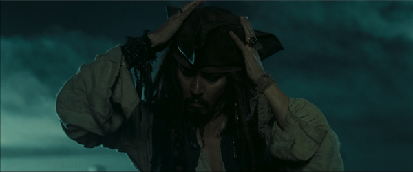
But
first Jack takes the time to put on his hat. It was established in the first film just how much he loves his hat and effects but it's reinforced here and it's important. Fairly soon we'll see him lose his hat and choose
not to retrieve it, something his crew understands to be
truly out of character. It will show just how afraid Jack is and how desperate he is to get to land. That scene really works because the storytellers take the time
here to remind us of Jack's infatuation with his hat. Again: set up, set up set up!!
Finally, to finish off the second sequence, we see Gibbs's hand ready to assist Jack aboard ship, but instead of Jack's hand...
... we get the corpse leg.
Not important by any means but a moment of that trademark quirkiness I love about Gore Verbinski's work. Jack climbs aboard and Gibbs, looking at the leg, says, "Not
exactly according to plan."
Jack: "Complications arose, ensued, were overcome." Typical Jack.
Gibbs asks if he got what he went in for and with that we're off to setting up the motivations for Jack's story arc.
The next sequence will establish Beckett's interests, Will's motivations, Whetherby's and Elizabeth's too, all of which set our protagonists against one another. And how great for our antagonist that he can turn the heroes against one another. Norrington and his desires will only complicate matters once he comes into the picture.
To me, this is what makes good writing/storytelling great: delivering the unexpected, doing it efficiently, minding the balance between plot and character, and always staying three steps ahead of your audience. Know your story inside and out and take the time to lay the groundwork early for what comes later.
Anywho, the two opening sequences of
Pirates of the Caribbean: Dead Man's Chest. Not a wasted shot. It's clean, efficient storytelling - everything full of meaning and consequence - and yet it doesn't feel rushed or confusing. It reintroduces all of our heroes as well as our villain, has fun defying your expectations while doing it, and does it all in 7 minutes.
Oh, and one last thing: even though he's not in the opening sequences of the film, I can't talk about PotC: DMC without mentioning my favorite villain ever:
Davy Jones. Weta threw down on ILM with the work they did on Gollum for the Lord of the Rings films but ILM, grabbing themselves by the bootstraps and hauling themselves back up, gave us Davy Jones and his crew. Well, them and
Bill Nighy. For my two cents: Best. Performance. Ever.