Friday, November 19, 2010

Operation Desert Storm, Part 4

Finally, some color! I was getting so antsy to start adding color to this piece. So antsy, in fact, that I didn't finish the grey toned art before I started coloring. I'm usually pretty linear in my work process but I'm never a hard-fast anything. "Don't confine me, man."

The entire illustration was created using Photoshop CS4 and then CS5 (upgrade time!).

My process here is pretty simple: I lay in flat colors to start with, just like when coloring a comic book page. The flat colors, like one flesh color to fill all of a person's flesh tones, allows me to go back later and select it easily with the magic wand tool. Looking at the first image here, however, I'm already not doing what I'm talking about, hahaha. Sometimes I jump ahead and finish off certain elements, like the yellow ribbon.

Just goes to show that no rules are ever iron clad. I usually like to keep my color layers to a minimum but I wanted to keep some editability on this one so I colored each object on its own layer (and/or layers). Yes, I think "editability" is a made up word, but I like it. Having the ribbon colors on its own layer allows me to go ahead and add my shadows/highlights now since all I have to do to "grab" it later is go to its layer.

After putting so much time and effort into the grey toned drawing, I want to keep the colors simple. When this is the goal I usually tend to get all my shadows done quickly by adding gradients. I will use a slightly darker version of the main color of the item and a nice shadow color, often in the purples or blues. I use the gradient tool, switching between multiply and color burn to slowly build the darks. In my mind highlights are what really make things 'pop' on an illustration, so that's where I want to concentrate my efforts. The darkest darks are often next to the lightest lights so I tend to lay in my shadow gradients originating from where I know the strongest highlights are going to be.

Shadows in place (and greatly defined by the original grey toned work), I go back in with the main color (the yellow of the ribbon in this case) and bring certain areas back to the original yellow and then beyond that into highlights. I use brushes for all of this, either ones I've made or ones I've found, all doing their best to replicate the look and feel of traditional brushes/mediums. Like the gradients, I build up the highlights slowly, keeping my brush on a low opacity - usually between 5 percent and 30 percent.

Now, back to the bigger picture. In the beginning I mainly want to get the basic "normal" colors for things in place. I can adjust the colors once they're all down. I know on this poster that I want that desert tan to dominate the palette. You can see on the American flag that it shows through, or tints the colors of the flag. This will carry through with the rest of the piece.

So after a full day's worth of work I've got the basic tan in place, the flag and ribbon finished, and flats in place for the 747 and departing soldiers, the F-16, the Apache, the gas masks, the destroyer, the camels, and the burning oil wells.


Another day finishes off the F-16 and the Apache, adds more detail to the burning wells, and adds flats to the couple hugging. I'm totally not flatting like I said I would. I think I'm so curious to see how some of it's going to turn out that I can't stop myself from jumping ahead.

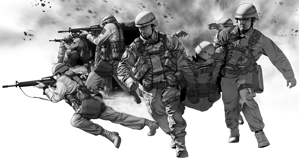
I finally get smart and get my buddy Rob to help me 'flat' a few of the elements while I move ahead and finish off the couple hugging and the soldiers getting on the plane. Rob flats the map, the combat scene, and the parade. I also get the basics down for the explosion. I'm making a conscious choice to keep as many of the colors as possible in the warm range - reds, oranges, yellows and browns. Cooler tones are kept low key and largely desaturated; they will also be tweaked later to add some warmth to them.


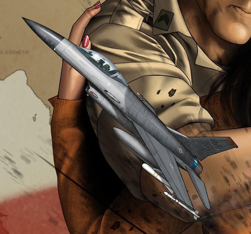
It's worth noting that at any point during the process I may see something in an element I've already finished and go back to work on it some more. The changes to any one element will be continuous throughout the entire coloring process. Here's a shot of the F-16 at 100 percent (full sized):

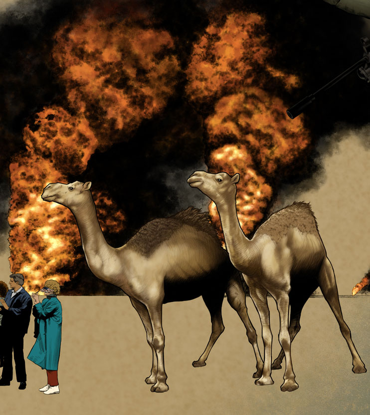
Day the next: I add some elements to the explosion, color the missile and it's smoke plume, finish off the tank (I obviously flatted it some time early and forgot to mention it), finish off the camels, and spend the rest of the day coloring the destroyer (my favorite part of the piece).


By this time in the process I'm getting loopy from lack of sleep. To be honest and forthright, this poster took twice as long as I anticipated. Because of that I felt a lot of stress for the three weeks that I was over my original deadline. I failed to anticipate the amount of extra time that would be needed for working on something this large. Had the finished piece been something like 9x12 inches (say a magazine page) it would have gone quicker, but the extra size exponentially increased the detail (at least it seemed like it to me). Lesson learned. I kept many late hours in an effort to get it done as quickly as I could and it really kicked me in the rear once it was all said and done. I need a nap just thinking about it.

So, a few hours of sleep later, I'm back on the job, finishing off the gas masks, the parade scene and the combat scene. I've also started tweaking colors to add the warmth I mentioned. I also add a color layer over the entire piece to not only add more warmth but to add a sense of cohesiveness to it all. We're getting close.


And finally I'm caught up to that last missing element: the local Kuwaiti people that the poster needs. It may seem like a small element; it's certainly not one of the more glamorous elements, but I think they're vitally important because these are the people who were directly affected by Operation Desert Storm. Never mind politics; any time your home is a stage for battle your life cannot help but be profoundly impacted. I also added the text that will eventually be on the piece. It's not the final location; I was just throwing ideas around at this point.


Here's a random close up of the medic in the combat scene:

And the finished poster. The last significant change was to add the Kuwaiti flag over Kuwait on the map. I would have preferred to keep it orange but can understand the client's desire to have Kuwaiti's colors represented.


As I mentioned in the beginning, the greatest challenge of the illustration was to design it so it would work 'as is' or with an optional portrait added, allowing a veteran who buys it to personalize it. Did I succeed? I still don't really know. I'm happy enough with it. I think it looks really cool with the portrait added but I like seeing the American flag when it's absent. Whatever the case, it is what it is. I'm really proud of the finished product and happy beyond belief to be done with it, hahaha. For the record, the optional portrait is not my art. It is to be done (or has been done in this case) by someone else.

Now back to comics...

Saturday, November 13, 2010

Operation Desert Storm, Part 3

It wasn't my original plan to save all of the human element until I had finished the technical element but that's the way it worked. I needed to shoot some reference for the human pieces and that kept me putting it off for awhile. First up (the easiest reference to shoot) was of the couple saying goodbye. The client wanted to have the woman's back to us, allowing her to be anyone - wife, girlfriend, mother, sister. Different vets left under different conditions; keeping the woman 'generic' allows for the broadest interpretation (pardon the pun, har har).

 The line art already finished is ghosted behind what I'm currently working on so that I can ensure I'm getting the placement I want. It also helps for avoiding tangents - places where edges touch. Tangents tend to draw the eye and in a successful illustration you don't want the eye going anywhere you (as the creator of the image) don't want it to go.

One of the things that sold me on drawing this digitally is that I could use Photoshop brushes to ensure a great variety of textures; something much more difficult to do with a pencil and paper. One great example is on the woman's hair. I was able to create the hair with a minimum of effort thanks to the right brush.

On the flip side, working digitally means that I'm working very large. I tend to always draw/paint digitally with my image at 100% in Photoshop. Zoom out and the line you lay down won't be as accurate and it also develops some squiggles sometimes. I mentioned that this file was really big. 18x24 inches at 450dpi. This next image is an example of what it looks like when I'm drawing at 100% - this is the 'actual' size of the image.

Unfortunately that size tends to require more time to finish things. It's a tough trade-off. The textures I was able to get into this poster are great (I'm happy with them anyway) but the time addition has been a real pain. I have definitely learned some lessons on this project.

Once I'm finished with the initial line work I change to a more painterly approach and start 'painting' in grey tones.

Next I add the remaining 'departure' elements - the yellow ribbon and the soldiers getting on a plane, bound for the Middle East.


Not all soldiers got there via chartered plane, but a lot did. I can tell you, it's a slightly surreal experience sitting on a plane dressed in your BDU's (Battle Dress Uniform) with nothing but a hundred and fifty other guys dressed exactly the same way. There's a brief scene of this in Jarhead, a fantastic movie that I relate to greatly, as I'm sure many veterans do. Unlike many hollywood films, Jarhead is, from my personal experience, a very accurate portrayal of life in the modern military. But I digress...

Here's another image showing the poster at full size.

And now the poster with these elements in place:

Gas masks. Man, I hated those things. If I thought I might die from some kind of poisoned gas though, I'd have that thing on is a second. The gas mask is only the start of it though. In the army we referred to such things as NBC warfare (Nuclear, Biological, and Chemical warfare). And to be fully protected you had do don your MOPP suit (Mission Oriented Protective Posture suit - to this day I still don't know what the hell that means). They are hot. They don't breathe. Once your gas mask is on your face will get hot. You will sweat, and when you sweat a bead of perspiration will eventually run down your face. It will itch like crazy and you know what? You can't scratch it.

You know what else you can't do? You can't eat in them. You can drink water from your canteen (there's a connection tube that connects to a little thingy on the top of your canteen) but that's it. Drill Sergeants and Platoon Sergeants like to have fun and torture you by making you wear them for hours at a time. Again, watch Jarhead; you'll have a slightly deeper understanding of those scenes after reading this. Maybe. Maybe not. But again, I digress...

Let's move to a happier subject: the homecoming parade. Operation Desert Storm was the first major military action by the US military since Viet Nam ended. One of the things that really scarred a lot of Viet Nam vets was the lack of support they received when the returned home. It took a lot of years but we eventually learned how damaging such treatment can be. When soldiers returned home from Kuwait a great deal was made to show that we had learned our lesson. The ensuing celebrations were as much for the Viet Nam vets as for the Desert Storm vets and for that reason it was a significant event and is, therefore, an important part of this poster.

Yet another image showing the full-sized drawing:

And the gas mask and parade elements integrated into the poster:

The next section I put off for as long as possible. The combat scene is arguably the most important part of the poster. It's where all the 'glamour' and drama are. It is the fears of the departing soldiers realized. It is the life-changing moment for that generation of soldiers. That's not really why I put it off so long though. I put it off because I knew it would be the most difficult. 

I found a good piece of reference but I had to change some elements not only to make it mine but also to make it fit the time frame correctly. That meant adding a lot of elements for which I didn't have photo reference. When I draw comics (and work from my head the vast majority of the time) this isn't really a big deal. When you're trying to draw a photorealistic illustration, however, it means a lot of work. It helps - a ton - to be so familiar with the equipment. I entered the army not long after Operation Desert Storm and therefore used all the same equipment they used. The uniform, the rifles, the LBV (Load Bearing Vest), the gas mask and it's container, the boots. It's all the same. I actually wore my desert boots just last week. Still, I had to add a lot of elements from my head, and it took me for-ever! I was right to be afraid of it.

Yet another full-sized image:

And the medics now being covered by Me, Me, and Me. Wanna see the reference pictures I took of myself for the scene? 

How does it feel to want, hahaha? Sorry, old joke.

Once again, having finished the line drawing, I move on and add the tonal elements.

Behind them, largely cropped in the above image, is an explosion. Here's a view of the entire combat element:

And the combat scene integrated into the final poster:

Technically this isn't the end of the grey tone work. There's one element left to add - a couple of Kuwaiti locals - but by now I was overly antsy to get started with the colors, so that's what I did and that's what the next post will cover.

Oh, I mentioned before that I'd show the Destroyer. I hadn't prepared any jpegs of it last time, so here it is. I think it might be my favorite part of the poster. I used Google SketchUp for most of the tech pieces. SketchUp is Google's free 3D software. The best part about it is that people, once they finish a model, can upload it to Google's 3D Warehouse where people like me can download them and use them for reference. I turn the model around in three dimensional space, alter the lighting and camera to get the shot I want, then render an image I can use in Photoshop as the basis for my underdrawing. 

These models, even when they are elaborate and impressively detailed, are still far from the detail of the real thing. I spent two days doing nothing but adding details to this destroyer. I think it was worth it.

See you next time in living color.