I just finished a page tonight that I hope I never have to repeat. 3 words: epic final battle. I've got several more pages of it too, but this one broke the ice. I'll share it later. Meanwhile, here are pages 1 and 2.
Saturday, July 16, 2011
Saturday, June 18, 2011
INSURRECTION, Issue 3
I just finished the second page of issue 4; it's my favorite page so far of the mini-series. Can't wait to share that one. Meanwhile, here are a few pages from issue 3. Can't show too much as it's not out yet.
Thursday, June 16, 2011
INSURRECTION mash-ups
What the hell's a mash-up? I dunno; I thought I heard the term somewhere but I might be making it up. I didn't want to share pages from issue 3 of INSURRECTION and chance spoiling things so instead I made a "mash-up" of my favorite panels. I liked the results so I did the same for issues 1 and 2. I did them as a large wallpaper basically, 2560x1600.
Monday, June 13, 2011
Monday, May 30, 2011
INSURRECTION, Issue 2 inks
I've posted this stuff on my DeviantArt page. It gets hard to keep up with all these "social media" sites, hahaha. Oh well. Issue 2 has been out for a bit and I'm just starting on the last page of issue 3 now.
All the pages from issues 1 and 2 have been inked at print size, meaning I print them on 9x12 2 ply bristol board and ink them at the actual size they will be printed. For anyone who doesn't know, most comics are inked larger than they reproduce, usually around 150% of the final size. I inked them small to help with my speed. I tend to put too much detail into larger pages, so working at the final size kept me from doing that.
It worked. The trick, then, was to apply the lessons to larger, normally sized ink pages, done on 11x17 2 ply bristol board. I went back to normal sized inking on issue 3 and I think the lessons have stuck pretty well. I'll share some of those pages in a bit.
I also do a lot of "post" work in Photoshop. I try to plan ahead and know what I'm going to want to do digitally, then ink areas according to what I'm going to do later. For example, I kept the inking on the rocks (on this first page) simple because I knew I planned to add some texture to them digitally. Explosions, planets, textures - these are the kinds of things that I find to be much more time efficient with Photoshop. I can also get textures that would be nearly impossible to get with paper and brushes and/or pens.
All the pages from issues 1 and 2 have been inked at print size, meaning I print them on 9x12 2 ply bristol board and ink them at the actual size they will be printed. For anyone who doesn't know, most comics are inked larger than they reproduce, usually around 150% of the final size. I inked them small to help with my speed. I tend to put too much detail into larger pages, so working at the final size kept me from doing that.
It worked. The trick, then, was to apply the lessons to larger, normally sized ink pages, done on 11x17 2 ply bristol board. I went back to normal sized inking on issue 3 and I think the lessons have stuck pretty well. I'll share some of those pages in a bit.
I also do a lot of "post" work in Photoshop. I try to plan ahead and know what I'm going to want to do digitally, then ink areas according to what I'm going to do later. For example, I kept the inking on the rocks (on this first page) simple because I knew I planned to add some texture to them digitally. Explosions, planets, textures - these are the kinds of things that I find to be much more time efficient with Photoshop. I can also get textures that would be nearly impossible to get with paper and brushes and/or pens.
Wednesday, April 06, 2011
More INSURRECTION stuff
I have a few colored pages on my DeviantArt site so I'll put them up here along with a couple of extras.
I finally finished the art for issue 2 and will post a few of those pages soon. I was wiped out for a couple of weeks with a bad cold so the issue is shipping a couple of weeks late. It's worth the wait though. the story gets very interesting in issue 2 and it's got a great ending. If the ending to issue 2 doesn't hook you then nothing will.
Just to be clear: when I talk up the book, I'm not referring to my art, I'm referring to the story. I didn't write it so I'm a fan like everyone else when it comes to this, the only difference being that reading the script is my equivalent to reading the comic. Blake Masters and Michael Alan Nelson have gone a great job of creating a world I find very interesting. I'm a huge sci-fi buff - I grew up reading sci-fi novels - so this is right up my alley. They also do a great job of letting the visuals do the heavy lifting in the book. That is a really nice thing for me and really helps to keep me invested in the story. If you read a lot of comics you'll find that a lot of writers feel the need to have dialogue in almost every panel, backing up or reiterating what is happening visually. Masters and Nelson aren't afraid to have entire pages without a lick of dialogue, which makes me want to ensure I do the visuals justice. It's a brave thing for them to do and I really appreciate it.
Darrin Moore, the colorist on the book, has done a great job. I really love to color my own work so it's hard to let go of these responsibilities. If you're not a top tier artist at Marvel or DC it seems to be a real crapshoot as to what you're going to get color-wise. A lot of colorists get jobs coloring because they know programs like Photoshop or Painter, not because they understand color theory. Darrin has done a great job. His work compliments my work quite well; it never dominates or confuses. Two issue in and I feel totally comfortable about what's going to come back from him. I'd work with him again in a heartbeat and let me tell you, that's a great feeling of relief. I hope, from the pages below, that you'll agree. There are some especially good pages from issue 2 that I can't wait to share.
And finally, I read the script for issue 3 last night and it just gets more and more interesting. Another good ending. The only real shame about this book is that it's only 4 issues.
I finally finished the art for issue 2 and will post a few of those pages soon. I was wiped out for a couple of weeks with a bad cold so the issue is shipping a couple of weeks late. It's worth the wait though. the story gets very interesting in issue 2 and it's got a great ending. If the ending to issue 2 doesn't hook you then nothing will.
Just to be clear: when I talk up the book, I'm not referring to my art, I'm referring to the story. I didn't write it so I'm a fan like everyone else when it comes to this, the only difference being that reading the script is my equivalent to reading the comic. Blake Masters and Michael Alan Nelson have gone a great job of creating a world I find very interesting. I'm a huge sci-fi buff - I grew up reading sci-fi novels - so this is right up my alley. They also do a great job of letting the visuals do the heavy lifting in the book. That is a really nice thing for me and really helps to keep me invested in the story. If you read a lot of comics you'll find that a lot of writers feel the need to have dialogue in almost every panel, backing up or reiterating what is happening visually. Masters and Nelson aren't afraid to have entire pages without a lick of dialogue, which makes me want to ensure I do the visuals justice. It's a brave thing for them to do and I really appreciate it.
Darrin Moore, the colorist on the book, has done a great job. I really love to color my own work so it's hard to let go of these responsibilities. If you're not a top tier artist at Marvel or DC it seems to be a real crapshoot as to what you're going to get color-wise. A lot of colorists get jobs coloring because they know programs like Photoshop or Painter, not because they understand color theory. Darrin has done a great job. His work compliments my work quite well; it never dominates or confuses. Two issue in and I feel totally comfortable about what's going to come back from him. I'd work with him again in a heartbeat and let me tell you, that's a great feeling of relief. I hope, from the pages below, that you'll agree. There are some especially good pages from issue 2 that I can't wait to share.
And finally, I read the script for issue 3 last night and it just gets more and more interesting. Another good ending. The only real shame about this book is that it's only 4 issues.
Thursday, March 24, 2011
C2E2: Year 2 in Review
So this was the second year Reed Exhibitions held the Chicago Comics and Entertainment Expo (C2E2). Last year was okay; it was the first year I ever had a table at a convention. I mostly ran around handing out page samples to different publishers. That paid off so this year I decided to keep my butt planted at my table the whole time. I'm glad I did because it was pretty amazing.
The show sold over twice the amount of tickets than the year before (they sold something like thirty five thousand tickets?). Friday and Saturday were nuts. Just nuts. The floor was swamped with people. Sunday was a little slower but I was ready for a slower pace by then. There was a great vibe to the show and the word of mouth was overwhelmingly positive. I feel confident that the it will just continue to get bigger and better. The staff was great; best I've seen at any show. Hats off to Mike Negin. He was in charge of Artist's Alley and was a constant presence all weekend, always checking to make sure we had everything we needed.
Met lots of interesting people. Stephanie, from Nova Scotia, gave me some great advice about web comics. Got some great advice about podcasting from a group of guys - I can't seem to find the business card they gave me at the moment. Their podcast has everything to do with nerd stuff. Or was it geek stuff? Met a few vets as well. One of them was an even bigger buff about World War II planes and than I am.
Costumes ran the gamut, as usual. Some of them were awesome for all the right reasons and some of them were awesome for all the wrong reasons, hahaha. Either way, they were all great. I commend them all; it takes moxie to dress up like some of them and go out in public. There's a great collection of pictures on Flickr: http://www.flickr.com/groups/c2e2/ The Monarch's henchmen from The Venture Brothers were my favorites.
Meanwhile, my goal for the show was to try and get a lot of work done (I'm behind on my work due to being sick for a week and a half) but I learned quickly that it was completely unrealistic. There were just too many people and the whole point of being there is to be social. I did do a few sketches that I was pretty happy with and I've got a list of commissions to start on once I get issue 2 of INSURRECTION finished.
I've learned a tremendous amount from these past two years and I'm really looking forward to next year. I'm hoping, actually, to attend another show later this year. Maybe Baltimore. I'll have lots of friends there and everyone seems to really love that show. Emerald Con in Seattle is the other show people really seem to love but it's too close to C2E2 currently.
It looks like there might be some nice opportunities coming out of the show this year as well. More on that if and when any of it becomes a reality. Meanwhile I've got lots of work to do. I don't know how I'm going to finish issue 2 of Insurrection on time but I'm going to try. STRIP MAGAZINE UK, the magazine I'm illustrating RECOVERY INCORPORATED for, is officially hitting the stands in May of this year. I'll be doing the cover for the third issue of the magazine so I'll be squeezing that into my schedule as well.
Back to work (when will I sleep again???)...
The show sold over twice the amount of tickets than the year before (they sold something like thirty five thousand tickets?). Friday and Saturday were nuts. Just nuts. The floor was swamped with people. Sunday was a little slower but I was ready for a slower pace by then. There was a great vibe to the show and the word of mouth was overwhelmingly positive. I feel confident that the it will just continue to get bigger and better. The staff was great; best I've seen at any show. Hats off to Mike Negin. He was in charge of Artist's Alley and was a constant presence all weekend, always checking to make sure we had everything we needed.
Met lots of interesting people. Stephanie, from Nova Scotia, gave me some great advice about web comics. Got some great advice about podcasting from a group of guys - I can't seem to find the business card they gave me at the moment. Their podcast has everything to do with nerd stuff. Or was it geek stuff? Met a few vets as well. One of them was an even bigger buff about World War II planes and than I am.
Costumes ran the gamut, as usual. Some of them were awesome for all the right reasons and some of them were awesome for all the wrong reasons, hahaha. Either way, they were all great. I commend them all; it takes moxie to dress up like some of them and go out in public. There's a great collection of pictures on Flickr: http://www.flickr.com/groups/c2e2/ The Monarch's henchmen from The Venture Brothers were my favorites.
Meanwhile, my goal for the show was to try and get a lot of work done (I'm behind on my work due to being sick for a week and a half) but I learned quickly that it was completely unrealistic. There were just too many people and the whole point of being there is to be social. I did do a few sketches that I was pretty happy with and I've got a list of commissions to start on once I get issue 2 of INSURRECTION finished.
I've learned a tremendous amount from these past two years and I'm really looking forward to next year. I'm hoping, actually, to attend another show later this year. Maybe Baltimore. I'll have lots of friends there and everyone seems to really love that show. Emerald Con in Seattle is the other show people really seem to love but it's too close to C2E2 currently.
It looks like there might be some nice opportunities coming out of the show this year as well. More on that if and when any of it becomes a reality. Meanwhile I've got lots of work to do. I don't know how I'm going to finish issue 2 of Insurrection on time but I'm going to try. STRIP MAGAZINE UK, the magazine I'm illustrating RECOVERY INCORPORATED for, is officially hitting the stands in May of this year. I'll be doing the cover for the third issue of the magazine so I'll be squeezing that into my schedule as well.
Back to work (when will I sleep again???)...
Sunday, February 06, 2011
More from Issue 1 of INSURRECTION
Just a couple more pages. Gotta keep the work coming or the blog gets to smelling stale, like old cheese.
I'm having a ton of fun working on this book. What? Oh, I hear Recovery Incorporated calling...
Wednesday, January 05, 2011
INSURRECTION
On top of RECOVERY INCORPORATED I'm now doing a four issue mini-series for BOOM Studios entitled - yeah, you guessed it - INSURRECTION. It's a sci-fi story, which I love, so I'm really excited about the whole thing. I grew up on science ficiton. Star Wars, Star Trek, novels by Larry Nivel, Jerry Pournelle, Greg Bear, Gregory Benford, Arthur C. Clarke, Heinlein, comics like Akira and Appleseed, etc...
I started out by doing some concept material. Not much, just to get the looks for the main characters down:
Once we got these going I did a refined version so the people doing the covers would know who I was basing each of the characters on:
I like to base characters off of real people if I can; it helps to make each one unique in character. It's so easy, when drawing comics, to just draw one body and head type for males and females. I don't want to fall into that trap so I look to actors or sports figures to help them become individuals. I won't necessarily try to always make the characters in the comic look just like the actors but I'll try to nail down the general idea. Also included here is the uniform idea for one of the two major groups in the story.
Next it gets a little more fun. Ship design. These are for a ship we see briefly in issue 1:
The FTL nacelles are a little too Star Trek like, so they'll be changing, but you get the idea. Last up for the concept stuff is a page from my sketchbook. My editors gave me a hint about something coming up in issue 2 so I did a page full of sketches. Not sure if any of them will make it through the process, but I had fun doing them.
Actually, now that I've read the script for issue 2, I'm pretty sure none of these will make it through. Oh well; maybe they'll still show up later.
Here's pages 1, 3, and 5 of issue 1:
The first issue comes out in March (early March I think). Okay, now back to work...
I started out by doing some concept material. Not much, just to get the looks for the main characters down:
Once we got these going I did a refined version so the people doing the covers would know who I was basing each of the characters on:
I like to base characters off of real people if I can; it helps to make each one unique in character. It's so easy, when drawing comics, to just draw one body and head type for males and females. I don't want to fall into that trap so I look to actors or sports figures to help them become individuals. I won't necessarily try to always make the characters in the comic look just like the actors but I'll try to nail down the general idea. Also included here is the uniform idea for one of the two major groups in the story.
Next it gets a little more fun. Ship design. These are for a ship we see briefly in issue 1:
The FTL nacelles are a little too Star Trek like, so they'll be changing, but you get the idea. Last up for the concept stuff is a page from my sketchbook. My editors gave me a hint about something coming up in issue 2 so I did a page full of sketches. Not sure if any of them will make it through the process, but I had fun doing them.
Actually, now that I've read the script for issue 2, I'm pretty sure none of these will make it through. Oh well; maybe they'll still show up later.
Here's pages 1, 3, and 5 of issue 1:
The first issue comes out in March (early March I think). Okay, now back to work...
Monday, December 13, 2010
RECOVERY INCORPORATED, pages 2 and 3
RECOVERY INCORPORATED is a comic my friend Dean and I are writing together and I'm illustrating. It's 8 pages a month and will be appearing in the forthcoming magazine entitles STRIP Magazine UK. You can see their blog here: link
It was originally going to hit the shelves in November 2010 but the publishing date got pushed back to February 2011 to avoid competing with all the other titles coming out around the holidays.
I should have copies of the first two issues with me at C2E2 in Chicago (March 2011). It's shaping up to be a great magazine and I feel really lucky to be a part of it.
Interesting big about page 3: it originally had more panels showing what was happening outside of the closet but my editor felt it would be a little more appropriate to keep the 'camera' in the closet and 'suggest' what was happening outside. I'm so glad it was suggested because I think this is a far better solution. My old teacher, Will Eisner, would be proud to see me using text as such an essential part of the storytelling. :-)
I also like seeing the shot of Mia (stuck in the closet) bigger. I think it's funny that this super cool chick is stuck in a closet, twiddling her thumbs, until the old man finishes using the bathroom and falls asleep again. It's the side of cool spy stuff you don't usually see.
Currently I'm hard at work on Chapter 2 and loving every second of it.
Pages are inked on bristol board with brush pens mainly, then scanned and colored in Photoshop. Panel borders, captions, balloons, and speed/motion lines are done in Manga Studio.
It was originally going to hit the shelves in November 2010 but the publishing date got pushed back to February 2011 to avoid competing with all the other titles coming out around the holidays.
I should have copies of the first two issues with me at C2E2 in Chicago (March 2011). It's shaping up to be a great magazine and I feel really lucky to be a part of it.
Interesting big about page 3: it originally had more panels showing what was happening outside of the closet but my editor felt it would be a little more appropriate to keep the 'camera' in the closet and 'suggest' what was happening outside. I'm so glad it was suggested because I think this is a far better solution. My old teacher, Will Eisner, would be proud to see me using text as such an essential part of the storytelling. :-)
I also like seeing the shot of Mia (stuck in the closet) bigger. I think it's funny that this super cool chick is stuck in a closet, twiddling her thumbs, until the old man finishes using the bathroom and falls asleep again. It's the side of cool spy stuff you don't usually see.
Currently I'm hard at work on Chapter 2 and loving every second of it.
Pages are inked on bristol board with brush pens mainly, then scanned and colored in Photoshop. Panel borders, captions, balloons, and speed/motion lines are done in Manga Studio.
To find out what happens next you'll have to get ahold of the magazine or wait until the collected version comes around. A clue: the magazine was originally going to be titled ACTION MAGAZINE. :-)
Friday, November 19, 2010
Operation Desert Storm, Part 4
Finally, some color! I was getting so antsy to start adding color to this piece. So antsy, in fact, that I didn't finish the grey toned art before I started coloring. I'm usually pretty linear in my work process but I'm never a hard-fast anything. "Don't confine me, man."
The entire illustration was created using Photoshop CS4 and then CS5 (upgrade time!).
My process here is pretty simple: I lay in flat colors to start with, just like when coloring a comic book page. The flat colors, like one flesh color to fill all of a person's flesh tones, allows me to go back later and select it easily with the magic wand tool. Looking at the first image here, however, I'm already not doing what I'm talking about, hahaha. Sometimes I jump ahead and finish off certain elements, like the yellow ribbon.
Just goes to show that no rules are ever iron clad. I usually like to keep my color layers to a minimum but I wanted to keep some editability on this one so I colored each object on its own layer (and/or layers). Yes, I think "editability" is a made up word, but I like it. Having the ribbon colors on its own layer allows me to go ahead and add my shadows/highlights now since all I have to do to "grab" it later is go to its layer.
After putting so much time and effort into the grey toned drawing, I want to keep the colors simple. When this is the goal I usually tend to get all my shadows done quickly by adding gradients. I will use a slightly darker version of the main color of the item and a nice shadow color, often in the purples or blues. I use the gradient tool, switching between multiply and color burn to slowly build the darks. In my mind highlights are what really make things 'pop' on an illustration, so that's where I want to concentrate my efforts. The darkest darks are often next to the lightest lights so I tend to lay in my shadow gradients originating from where I know the strongest highlights are going to be.
Shadows in place (and greatly defined by the original grey toned work), I go back in with the main color (the yellow of the ribbon in this case) and bring certain areas back to the original yellow and then beyond that into highlights. I use brushes for all of this, either ones I've made or ones I've found, all doing their best to replicate the look and feel of traditional brushes/mediums. Like the gradients, I build up the highlights slowly, keeping my brush on a low opacity - usually between 5 percent and 30 percent.
Now, back to the bigger picture. In the beginning I mainly want to get the basic "normal" colors for things in place. I can adjust the colors once they're all down. I know on this poster that I want that desert tan to dominate the palette. You can see on the American flag that it shows through, or tints the colors of the flag. This will carry through with the rest of the piece.
So after a full day's worth of work I've got the basic tan in place, the flag and ribbon finished, and flats in place for the 747 and departing soldiers, the F-16, the Apache, the gas masks, the destroyer, the camels, and the burning oil wells.
Another day finishes off the F-16 and the Apache, adds more detail to the burning wells, and adds flats to the couple hugging. I'm totally not flatting like I said I would. I think I'm so curious to see how some of it's going to turn out that I can't stop myself from jumping ahead.
I finally get smart and get my buddy Rob to help me 'flat' a few of the elements while I move ahead and finish off the couple hugging and the soldiers getting on the plane. Rob flats the map, the combat scene, and the parade. I also get the basics down for the explosion. I'm making a conscious choice to keep as many of the colors as possible in the warm range - reds, oranges, yellows and browns. Cooler tones are kept low key and largely desaturated; they will also be tweaked later to add some warmth to them.
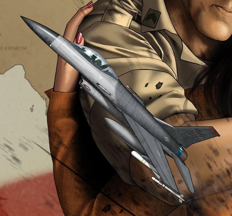
It's worth noting that at any point during the process I may see something in an element I've already finished and go back to work on it some more. The changes to any one element will be continuous throughout the entire coloring process. Here's a shot of the F-16 at 100 percent (full sized):
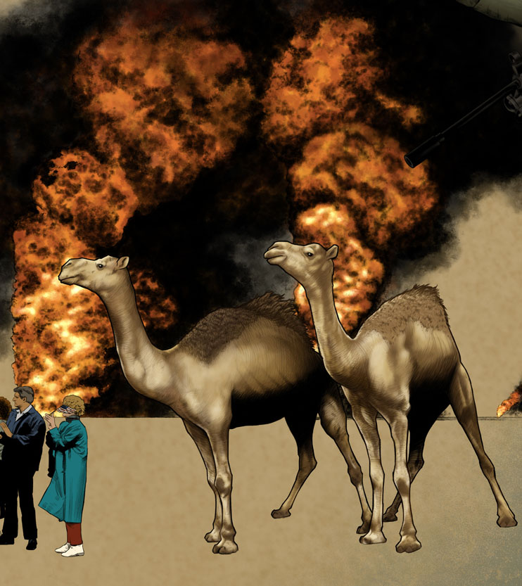
Day the next: I add some elements to the explosion, color the missile and it's smoke plume, finish off the tank (I obviously flatted it some time early and forgot to mention it), finish off the camels, and spend the rest of the day coloring the destroyer (my favorite part of the piece).
By this time in the process I'm getting loopy from lack of sleep. To be honest and forthright, this poster took twice as long as I anticipated. Because of that I felt a lot of stress for the three weeks that I was over my original deadline. I failed to anticipate the amount of extra time that would be needed for working on something this large. Had the finished piece been something like 9x12 inches (say a magazine page) it would have gone quicker, but the extra size exponentially increased the detail (at least it seemed like it to me). Lesson learned. I kept many late hours in an effort to get it done as quickly as I could and it really kicked me in the rear once it was all said and done. I need a nap just thinking about it.
So, a few hours of sleep later, I'm back on the job, finishing off the gas masks, the parade scene and the combat scene. I've also started tweaking colors to add the warmth I mentioned. I also add a color layer over the entire piece to not only add more warmth but to add a sense of cohesiveness to it all. We're getting close.
And finally I'm caught up to that last missing element: the local Kuwaiti people that the poster needs. It may seem like a small element; it's certainly not one of the more glamorous elements, but I think they're vitally important because these are the people who were directly affected by Operation Desert Storm. Never mind politics; any time your home is a stage for battle your life cannot help but be profoundly impacted. I also added the text that will eventually be on the piece. It's not the final location; I was just throwing ideas around at this point.
Here's a random close up of the medic in the combat scene:
And the finished poster. The last significant change was to add the Kuwaiti flag over Kuwait on the map. I would have preferred to keep it orange but can understand the client's desire to have Kuwaiti's colors represented.
As I mentioned in the beginning, the greatest challenge of the illustration was to design it so it would work 'as is' or with an optional portrait added, allowing a veteran who buys it to personalize it. Did I succeed? I still don't really know. I'm happy enough with it. I think it looks really cool with the portrait added but I like seeing the American flag when it's absent. Whatever the case, it is what it is. I'm really proud of the finished product and happy beyond belief to be done with it, hahaha. For the record, the optional portrait is not my art. It is to be done (or has been done in this case) by someone else.
Now back to comics...
The entire illustration was created using Photoshop CS4 and then CS5 (upgrade time!).
My process here is pretty simple: I lay in flat colors to start with, just like when coloring a comic book page. The flat colors, like one flesh color to fill all of a person's flesh tones, allows me to go back later and select it easily with the magic wand tool. Looking at the first image here, however, I'm already not doing what I'm talking about, hahaha. Sometimes I jump ahead and finish off certain elements, like the yellow ribbon.
Just goes to show that no rules are ever iron clad. I usually like to keep my color layers to a minimum but I wanted to keep some editability on this one so I colored each object on its own layer (and/or layers). Yes, I think "editability" is a made up word, but I like it. Having the ribbon colors on its own layer allows me to go ahead and add my shadows/highlights now since all I have to do to "grab" it later is go to its layer.
After putting so much time and effort into the grey toned drawing, I want to keep the colors simple. When this is the goal I usually tend to get all my shadows done quickly by adding gradients. I will use a slightly darker version of the main color of the item and a nice shadow color, often in the purples or blues. I use the gradient tool, switching between multiply and color burn to slowly build the darks. In my mind highlights are what really make things 'pop' on an illustration, so that's where I want to concentrate my efforts. The darkest darks are often next to the lightest lights so I tend to lay in my shadow gradients originating from where I know the strongest highlights are going to be.
Shadows in place (and greatly defined by the original grey toned work), I go back in with the main color (the yellow of the ribbon in this case) and bring certain areas back to the original yellow and then beyond that into highlights. I use brushes for all of this, either ones I've made or ones I've found, all doing their best to replicate the look and feel of traditional brushes/mediums. Like the gradients, I build up the highlights slowly, keeping my brush on a low opacity - usually between 5 percent and 30 percent.
Now, back to the bigger picture. In the beginning I mainly want to get the basic "normal" colors for things in place. I can adjust the colors once they're all down. I know on this poster that I want that desert tan to dominate the palette. You can see on the American flag that it shows through, or tints the colors of the flag. This will carry through with the rest of the piece.
So after a full day's worth of work I've got the basic tan in place, the flag and ribbon finished, and flats in place for the 747 and departing soldiers, the F-16, the Apache, the gas masks, the destroyer, the camels, and the burning oil wells.
Another day finishes off the F-16 and the Apache, adds more detail to the burning wells, and adds flats to the couple hugging. I'm totally not flatting like I said I would. I think I'm so curious to see how some of it's going to turn out that I can't stop myself from jumping ahead.
I finally get smart and get my buddy Rob to help me 'flat' a few of the elements while I move ahead and finish off the couple hugging and the soldiers getting on the plane. Rob flats the map, the combat scene, and the parade. I also get the basics down for the explosion. I'm making a conscious choice to keep as many of the colors as possible in the warm range - reds, oranges, yellows and browns. Cooler tones are kept low key and largely desaturated; they will also be tweaked later to add some warmth to them.
It's worth noting that at any point during the process I may see something in an element I've already finished and go back to work on it some more. The changes to any one element will be continuous throughout the entire coloring process. Here's a shot of the F-16 at 100 percent (full sized):
Day the next: I add some elements to the explosion, color the missile and it's smoke plume, finish off the tank (I obviously flatted it some time early and forgot to mention it), finish off the camels, and spend the rest of the day coloring the destroyer (my favorite part of the piece).
By this time in the process I'm getting loopy from lack of sleep. To be honest and forthright, this poster took twice as long as I anticipated. Because of that I felt a lot of stress for the three weeks that I was over my original deadline. I failed to anticipate the amount of extra time that would be needed for working on something this large. Had the finished piece been something like 9x12 inches (say a magazine page) it would have gone quicker, but the extra size exponentially increased the detail (at least it seemed like it to me). Lesson learned. I kept many late hours in an effort to get it done as quickly as I could and it really kicked me in the rear once it was all said and done. I need a nap just thinking about it.
So, a few hours of sleep later, I'm back on the job, finishing off the gas masks, the parade scene and the combat scene. I've also started tweaking colors to add the warmth I mentioned. I also add a color layer over the entire piece to not only add more warmth but to add a sense of cohesiveness to it all. We're getting close.
And finally I'm caught up to that last missing element: the local Kuwaiti people that the poster needs. It may seem like a small element; it's certainly not one of the more glamorous elements, but I think they're vitally important because these are the people who were directly affected by Operation Desert Storm. Never mind politics; any time your home is a stage for battle your life cannot help but be profoundly impacted. I also added the text that will eventually be on the piece. It's not the final location; I was just throwing ideas around at this point.
Here's a random close up of the medic in the combat scene:
And the finished poster. The last significant change was to add the Kuwaiti flag over Kuwait on the map. I would have preferred to keep it orange but can understand the client's desire to have Kuwaiti's colors represented.
As I mentioned in the beginning, the greatest challenge of the illustration was to design it so it would work 'as is' or with an optional portrait added, allowing a veteran who buys it to personalize it. Did I succeed? I still don't really know. I'm happy enough with it. I think it looks really cool with the portrait added but I like seeing the American flag when it's absent. Whatever the case, it is what it is. I'm really proud of the finished product and happy beyond belief to be done with it, hahaha. For the record, the optional portrait is not my art. It is to be done (or has been done in this case) by someone else.
Now back to comics...
Subscribe to:
Posts (Atom)